
The Price and Feature Trap

Capable gets you shortlisted. Distinct gets you chosen.

The belief: build it better and they'll choose it
Most of us start with the same belief. If the product is better, customers will notice. Better materials, a smarter mechanism, one more feature, a sharper price. It sounds like plain common sense, and for a while it works.
But if you're building a consumer product or running a growing business, you've probably seen what happens next. You improve the product, invest in development and make it more capable. Yet customers still compare you with competitors selling something similar for less.
So, how do you compete with cheaper competitors without constantly reducing your price?
The answer isn't always to build more. Sometimes, it's to give customers a better reason to choose you.
The conflict: capable isn't the same as chosen
Here's the catch. Walk into any crowded category and count the products that do the job well. Dozens. But the customer can't see your tolerances, your supplier checks or the months you spent getting the mechanism right. All they see is what's in front of them: a pack, a page, a price.
So when products look and sound alike, people compare the only things that are easy to compare. Price. And the feature list.
That's the trap. You add a feature to stand out. A competitor matches it within a season. The list gets longer, the gap stays the same, and the one column left to argue about is price. Features don't get you out of the trap. They feed it, because function is the easiest thing in any market to copy.
This is where product differentiation becomes important. If customers can't understand why your product is different, even a genuinely better product can struggle to justify its price.
Categories also pull everyone towards the same look and the same words: the same blue, the same kraft-and-green, the same "seamless" and "end-to-end". Blending in feels safe. It reads as legitimate, and nobody gets blamed for following the leaders. But safe at the design table means invisible on the shelf. Customers assume you're the same as everyone else, glance past you, or ask for a discount.
Even strong brands get copied into sameness: when Parle Agro refreshed Appy Fizz in 2023, Pentagram's stated aim was to move it away from the crowd of copycats.
The lesson for businesses investing in product design and brand strategy is simple: being different isn't enough. Customers need to recognise that difference and understand why it matters.
The real-world example: the glue every Indian knows
Think about adhesives. On paper, one white glue looks a lot like another. That's exactly the kind of category where price should rule.
Yet in India most people don't ask for glue. They ask for Fevicol.
Pidilite launched it in 1959 as an easier alternative to the old fat-based glues that had to be melted before use. For roughly its first thirty years, Fevicol's own marketing head says, it was one product fighting it out among many. The early 1990s brought serious brand building, starting with the Dum Laga Ke Haisha campaign. The line that carries the brand is Fevicol ka mazboot jod. A strong bond.
Notice what that line doesn't say. No resin type. No setting time. It sells a feeling: this will hold.
Now look at it from the carpenter's side, because he's the one who picks the glue. In a furniture or interiors job, the glue is a tiny slice of the total cost. A joint that fails costs him his name. So he isn't hunting for the cheapest tube. He wants the one he won't get blamed for. That's the real reason to choose, and it never shows up on a spec sheet. (That's our reading of his logic, not Pidilite's.)
And it stuck. People now say "Fevicol ka jod" about any strong bond, and in 2014 the Prime Minister described India–Japan ties as stronger than it.
Fevicol is a useful example of how brand positioning works. The product has a functional job, but the brand makes its promise memorable. Customers aren't just buying adhesive; they're buying confidence in the result.
Two more you'll recognise.
Frooti launched in 1985 in a Tetra Pak, when most drinks came in glass bottles or pouches. By 2015, Parle Agro felt the brand had come to look like a kids' drink. It brought in Pentagram with a simple brief: change everything except the name. The company reported 60% growth on the first SKUs to get the new pack. One caveat: the recipe was tweaked and a big campaign followed, so don't credit the pack alone. The point is the thinking. They changed what the brand says about its buyer.
It's a good example of packaging design doing more than making a product look attractive. The pack can change how people perceive a brand, who they think it's for and whether it feels relevant to them.
The Royal Enfield Bullet has been made in Chennai since the 1950s, and its design stayed almost unchanged for years. It's often cited as the longest-running motorcycle series in production. It can't have won a feature race. People chose what it says about them. (Again, our read.)
These brands operate in different categories, but the underlying idea is similar: a reason to choose can be more powerful than another feature.

The reframe: from "Is it good?" to "Is it distinct?"
"Is it good?" is an inward question. It measures you against your own standard. And today's exciting feature is tomorrow's baseline. Good keeps you in the running. It doesn't win the decision.
"Is it distinct?" looks outward. Could a customer swap you for someone else and lose nothing?
A product is what you make. A reason to choose is what they believe.
This is where design earns its seat. Not as styling at the end, but as the thing that makes your invisible strengths visible: the pack, the first touch, the page, the unboxing. Customers decide on what they can see and feel. Emotion first, logic to justify it later. Design puts the value where they can see it.
For a business, this means thinking about product design, packaging design and brand identity as connected parts of the same experience. The product needs to work well, but the way it looks, feels and communicates should help customers understand why it's worth choosing.
This is especially important for startups and consumer brands competing against established players. You may not have their manufacturing scale or marketing budget. But you can still build a clearer position around a specific customer, a meaningful benefit and a recognisable experience.
So the question for every decision changes. Not "Can we match the market leader?" but: Does this say who we are in a way no competitor can copy?
The framework: Does, Feels, Says
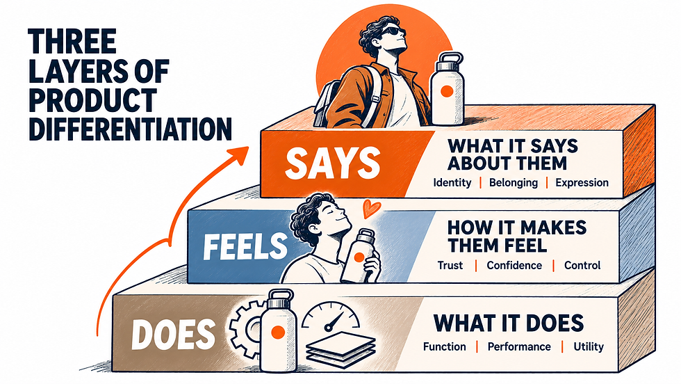
Reasons to choose stack in three layers.
What it does. Function: faster, safer, cheaper to run. Necessary, and the easiest layer to copy.
How it makes them feel. Safe, in control, free of friction. This is the layer that supports a premium.
Who it says they are. Identity. People pick brands that say something about who they are and who they belong with. The product becomes a badge.
Read the brands above through it. Fevicol lives on layer two: this will hold, and I won't be blamed. Frooti worked on layer three, moving from a kids' drink to a brand for young adults. The Bullet is layer three almost entirely. None of them won by adding a row to the spec sheet. Most feature lists sit entirely on layer one. Strong propositions compound across all three.
This framework can help when you're developing a new product, planning a product redesign or working out how to differentiate your brand in a crowded market. It gives you a way to look beyond features and identify the value customers actually care about.
The one-line test. Finish this sentence without naming a single feature:
"Choose us if you ______."
Weak: "Choose us because we offer 24/7 cloud sync, an intuitive UI and 99.9% uptime." Any competitor can say it.
Strong: "Choose us if you believe running your business shouldn't cost you your evenings."
For a glue, it might read: "Choose this one if you never want to think about the joint again." (Our wording, not Pidilite's.)
If the blank can only be filled with tools and parameters, you have a capable product. You don't yet have a reason to choose.
Where to follow the category, and where to break it. Conform on comprehension. Revolt on meaning.
Keep convention where people need to understand and use the product: what it is within three seconds, how it opens, how checkout works.
Break convention where identity lives: palette, silhouette, tone of voice, one signature moment.
Try this week:
Write your one-line sentence. If it needs a feature, rewrite it until it doesn't.
Put your pack or homepage beside three competitors with the logos covered. Can a stranger tell which one is yours?
Go through your spec sheet. Mark each item "table stakes" or "ours alone".
The takeaway
Specs get you shortlisted. A reason gets you chosen.
So ask the one question that matters: what would make a customer choose us even if a competitor were cheaper or had more features? If you can't answer in one sentence, that's the work to do before the next feature, the next discount or the next rebrand.
Q&A: questions founders ask
1. How do I compete with a competitor who sells the same product for less?
First check that the product and the price are really the same. If they are, stop trying to win at being cheaper: a bigger rival with lower costs can outlast you on price. Focus on product differentiation instead. Offer something customers can't line up side by side, like a clearer promise, a better customer experience at every touchpoint, or a point of view. Then go after the buyers who want that.
2. How do I differentiate a product in a crowded market where everything looks the same?
Audit three competitors: palette, pack or shape, language, claims. Whatever they all share is the category convention. Keep it for understanding and use. Break it for meaning: colour, tone of voice, one signature moment. Then write your "Choose us if…" line. This is a practical starting point for product differentiation through design.
3. Does design affect pricing power for physical products?
It can, when it makes value visible. Packaging, form, unboxing and first use are where customers judge quality before they can verify it. Design applied as styling at the end does little. Design as strategy decides what you stand for, and helps you hold a premium instead of being negotiated down.
Comments